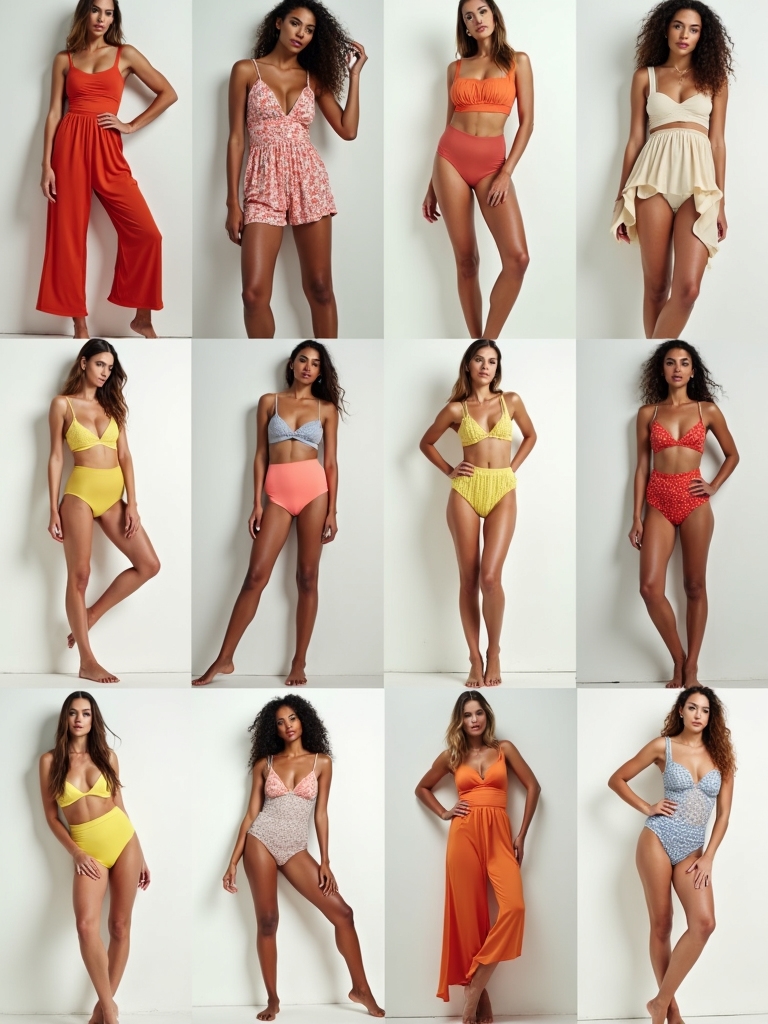
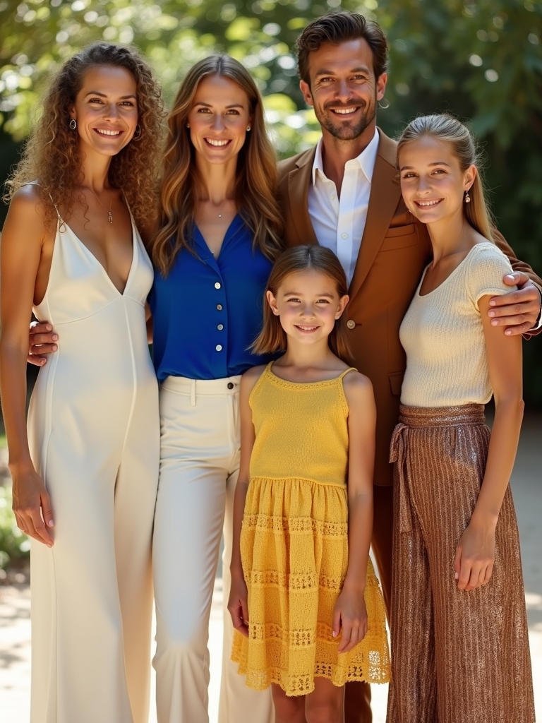
I help you create sun-ready family looks that coordinate without matching, using a core palette of breathable neutrals, accents, marine hints. I mix textures and patterns with balance, pairing matte fabrics with soft sheen and anchoring outfits with one dominant print plus echo colors. I favor color blocking, harmonious footwear, and thoughtful hero pieces to keep every silhouette distinct yet truly cohesive. Want tips to make this summer shoot flawless? Stay with me for ideas.
How to Choose a Core Color Palette for Summer Family Photo Outfits
I start by choosing a simple core palette that’s sum‑friendly and photo‑ready.
I look for breathable neutrals, sunny accents, and a few marine hints to unify outfits without uniformity.
I keep contrast gentle, and I invite you to test combinations on a white backdrop, ensuring harmony across ages, genders, and personalities.
Together we translate that balance into timeless, fresh summer looks everywhere. Additionally, incorporating cozy textures into your outfits can enhance the overall visual appeal and comfort.
How to Mix Textures and Patterns Without Looking Busy
When you mix textures and patterns, the goal is harmony, not chaos. I choose one anchor, then layer subtle accents to breathe without shouting.
Here’s how I picture it:
- Pair matte with a gentle sheen
- Vary scale: big and small motifs
- Tie color through one accessory
- Reserve busy prints for small doses
Incorporating cozy layering ideas can enhance your overall look and create a polished appearance. The result feels intentional, effortless, ready for sunny family moments.
Color Blocking for Cohesion Without Uniformity
I love bold color pairing to keep our family photos vibrant without feeling stilted. A cohesive color palette ties us together while letting each person bring their own style with confidence. Incorporating stylish fall outfit ideas can elevate our family’s look while ensuring we all feel comfortable and stylish.
Bold Color Pairing
Though bold color pairing can feel intimidating, it creates visual rhythm across family photos—and I love how it lets each person shine.
I balance hues, avoid exact matches, and let bold tones anchor the scene.
- Bold blocks echoing accents
- Complementary neutrals as anchors
- A single bright pop per frame
- Subtle patterns for texture
This approach feels lively, cohesive, and timeless for everyone.
Cohesive Color Palettes
Three simple rules help us craft cohesive color palettes through color blocking, keeping harmony without uniformity.
I mix soft neutrals with a pop of color, then repeat accents across outfits to knit looks together without sameness.
You’ll notice balance is intentional, not fussy, and small gestures—like matching hems or accessories—create a unified, joyful family story.
That’s how cohesion feels in pictures together. Incorporating seasonal wardrobe refresh into your outfits can elevate the overall aesthetic and provide fresh inspiration.
Contrast Without Uniformity
Contrast is the spice that keeps color blocking lively without locking us into uniform outfits.
- Pistachio greens paired with coral accents for brightness.
- Indigo jeans meeting sunflower tops with white sneakers.
- Blush pinks layered under navy, for subtle drama.
- Burnt orange accessories tie opposite pieces together.
I love how contrast unifies photos without forcing sameness, letting personalities glow and families feel effortless. Embracing cozy burgundy looks can also enhance the autumnal vibe in your family pictures.
Select a Hero Piece for Each Person to Balance the Look
I start by choosing a hero piece for each person—the item that anchors their look—so the whole family reads as coordinated on camera.
I pick pieces with distinct textures, colors, and silhouettes that echo one another without duplicating. This anchors variation, creates rhythm, and keeps each portrait lively, cohesive, and effortlessly stylish in sunny light.
Confidence grows when every hero feels seen.
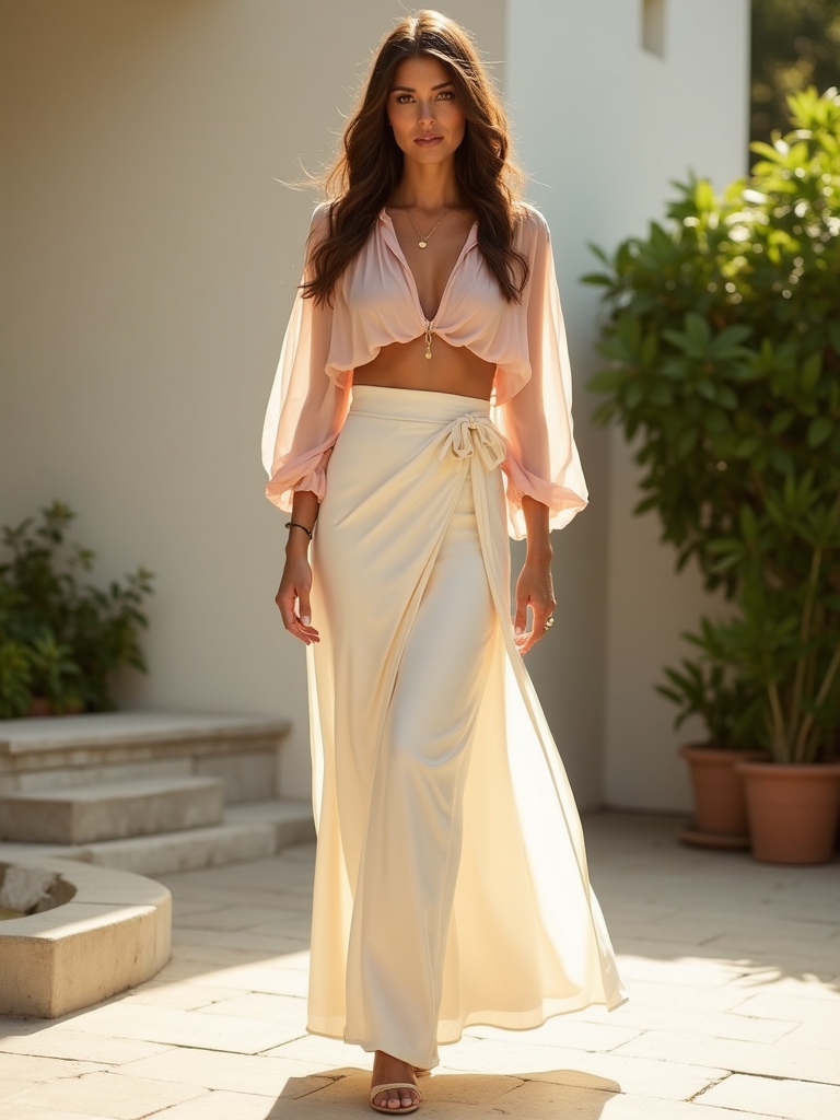
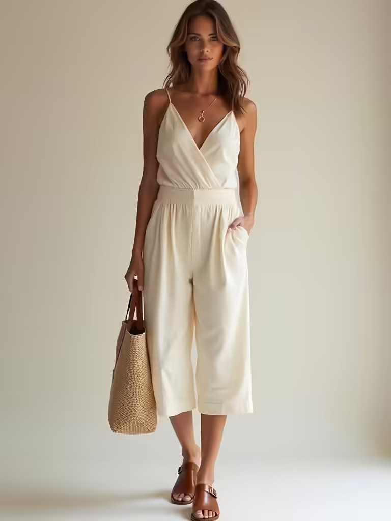
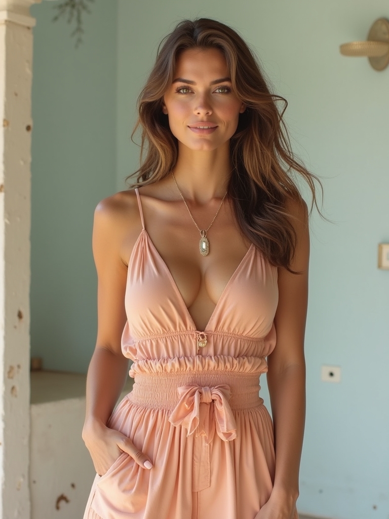
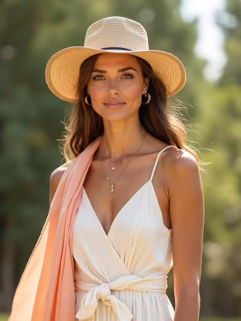
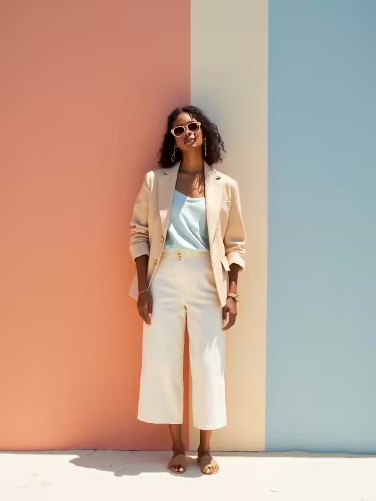
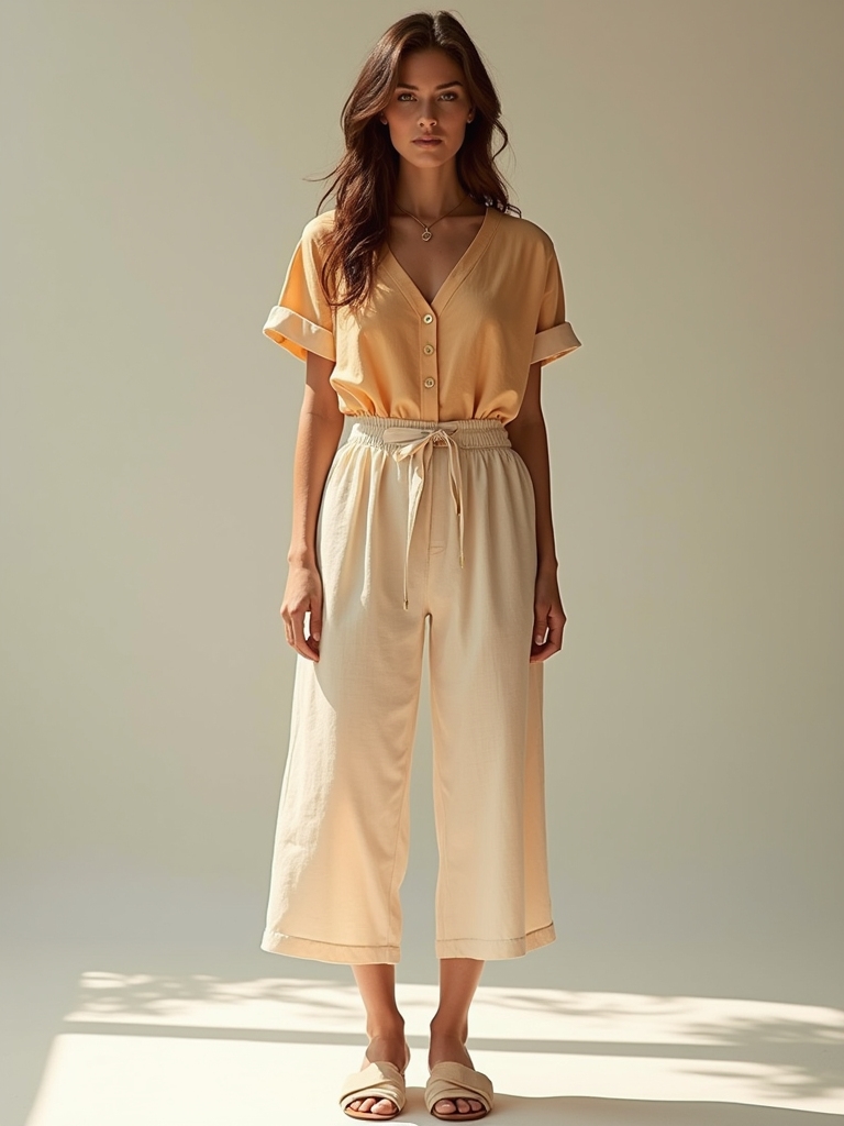
Neutrals With Pops of Color for Sunny Photos
I love neutrals with color pops, and a sunlit palette pairing soft Subtle Hues with Bold Accents that still feel cohesive.
I start with a quiet neutral base—ivory, taupe, or warm gray—and let one bold piece do the talking in coral, sky blue, or sunny yellow.
I finish with light, airy accessories to tie the look together without overpowering the scene. Embracing Italian Summer Outfits can elevate your family’s style while keeping the vibe relaxed and chic.
Neutrals With Color Pops
Three easy combos make neutrals sparkle with color in sunny photos.
1) Ivory with coral pops
2) Taupe paired with electric blue accents
3) Beige finished with mint highlights
4) Gray layered with sunny yellow touches
These combos keep outfits cohesive yet lively, so sunny portraits feel polished.
I guide you to pick one neutral base and a bright accent for balance.
Sunlit Palette Pairings
Sunlit palettes come alive when neutrals meet pops of color, turning sunny portraits into cohesive, glow-filled scenes.
I guide you to mix softenings like ivory with citrus or taupe with sapphire, keeping silhouettes clean and fabrics airy.
You’ll notice balance emerges when one bright note anchors the look, while others breathe around it.
This approach feels effortless and ready for sunny frames. Incorporating Old Money aesthetics into your summer outfits can elevate your family’s look with timeless sophistication.
Subtle Hues, Bold Accents
When you pair soft neutrals with bold accents, sunny portraits stay calm yet energized.
- I pair creamy whites with a dusty rose pop.
- I anchor outfits with navy and olive.
- I keep patterns subtle, textures vivid.
- I finish with a sunny coral accessory.
Together, these choices feel cohesive, camera-ready, and effortlessly chic for a sunlit family story. Incorporating elements of old money style can elevate your family’s look with a timeless elegance.
You’ll love the balance everywhere.
Age-Appropriate Dress Ideas That Still Feel Connected
If I’m putting together outfits that feel connected without tipping into costume-y, I lean on timeless silhouettes, comfortable fabrics, and cohesive color stories that work for all ages.
I’m not hiding size differences—I’m embracing them with versatility, ease, and a shared mood. I favor soft prints and subtle textures that translate across generations, with easy layering and forgiving fits.
Clean lines, breathable cottons, and palette shifts keep the look polished yet playful for every family member.
Thoughtful Accessories to Tie Everyone Together
Think of accessories as the thread that pulls our photos from chaos to cohesive charm.
I love how we can coordinate belts, hats, and jewelry across outfits, creating a subtle rhythm without feeling matchy.
And we’ll also pick a few statement pieces for each person—bold yet balanced—so every smile has a companion in the frame.
Coordinated Accessories Across Outfits
To tie everyone’s look together, I start with a shared color palette and a few signature accessories that echo across outfits.
1) coordinated hats in linen
2) matching leather belts
3) complementary acetate sunglasses
4) tonal jewelry in brass and pearl
These echoes stitch individuality into a shared moment, creating cohesive photos that feel intentional, polished, and effortlessly stylish for everyone today.
Statement Pieces For All
Building on the echoes from our coordinated accessories, I elevate the look with one bold piece per person that still feels cohesive.
I choose statement items—like a vibrant scarf, a textured belt, or a sunny hat—that unify colors and tones without dominating.
Each person wears a focal accent, creating harmony, depth, and effortless summertime chic.
Let the photos glow with refined personality.
Footwear That Coordinates Without Stealing the Scene
Ever notice how the right shoes tie the whole family look together without shouting?
I choose footwear that complements, not competes, and keep the vibe clean and summery.
- Neutral sandals with cohesive soles
- Soft espadrilles for everyone
- Minimalist sneakers in a shared color family
- Low-profile loafers for dad and mom alike
They keep the focus where it belongs.
Print Mixing Rules for a Cohesive Family Shot
If you want a cohesive family shot, I start with one anchor print and build from there.
Pick a dominant color and let others echo it in smaller doses; mix patterns with respect for scale, repetition, and contrast.
Use stripes with florals, checks with solids, but avoid competing motifs.
Keep accessories minimal, textures varied, and timing precise for a polished, harmonious result.
Heat-Friendly Fabrics and Packing Tips for Travel Days
When travel brings heat, I reach for breathable fabrics like cotton, linen, and moisture-wicking blends to stay cool and comfortable all day.
1) Pack lightweight layers
2) Choose moisture-wicking pieces
3) Use airy totes and breathable shoes
4) Roll outfits to save space
I keep essentials compact, and plan one outfit per travel day to minimize fuss, heat, and laundry while preserving cohesion for the trip.
Quick Outfit Formulas You Can Mix and Match
Three quick outfit formulas keep my family coordinated with zero fuss, and I mix and match them in minutes.
I rely on a denim staple, a breathable top, and a pop of color. Add coordinating bottoms or a simple layer, and everyone looks intentional without duplicating outfits.
You’ll see how small swaps reshape the vibe for sunny days and candid smiles today.
Conclusion
I hope you feel inspired to mix, not mirror your crew. With a core palette, you’ll keep every frame connected while each personality shines. I love how textures and a single hero piece can create depth without shouting. Think neutrals kissed by color, print clashes kept playful, and lightweight fabrics that travel as smooth as a breeze. When you step in front of the camera, you’ll look coordinated, confident, and you—like a painter’s palette alive.