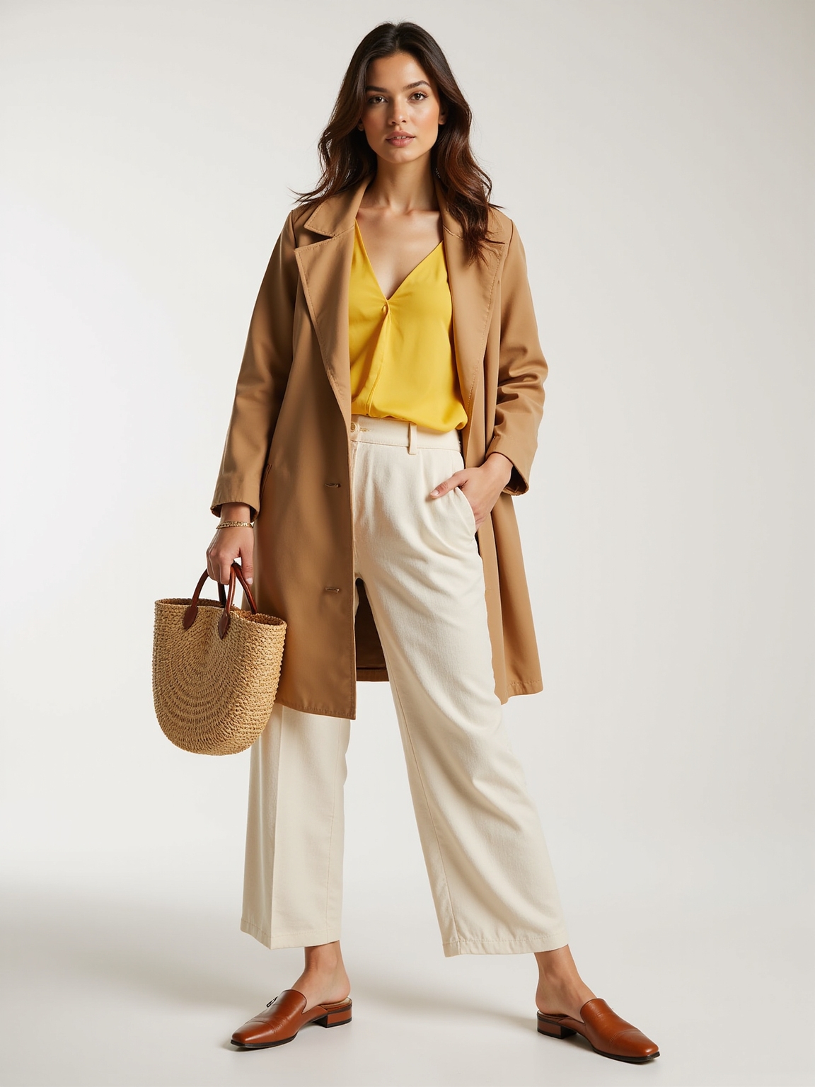
I love how Warm Spring colors instantly lift your skin—think buttery daffodil, sunlit apricot, warm peach and coral that make you look rested and radiant. Try camel or honey beige bases, a coral blouse, and a teal accessory for fresh contrast; gold jewelry and cream shoes finish the look.
Swatch on your jawline in natural light to confirm. Keep fabrics light and layered for effortless polish—stay here and I’ll show the exact shades, formulas, and fixes.
3 Quick Checks to Confirm Warm Spring
Let’s zero in on whether you’re a Warm Spring — I’ll walk you through a few quick, reliable checks that cut through the guessing.
I look at veins (warm greens or olive), jewelry preference (gold feels natural), eye and hair warmth, and how peachy or golden foundations blend.
If warm, clear colors revive you, you’re likely Warm Spring.
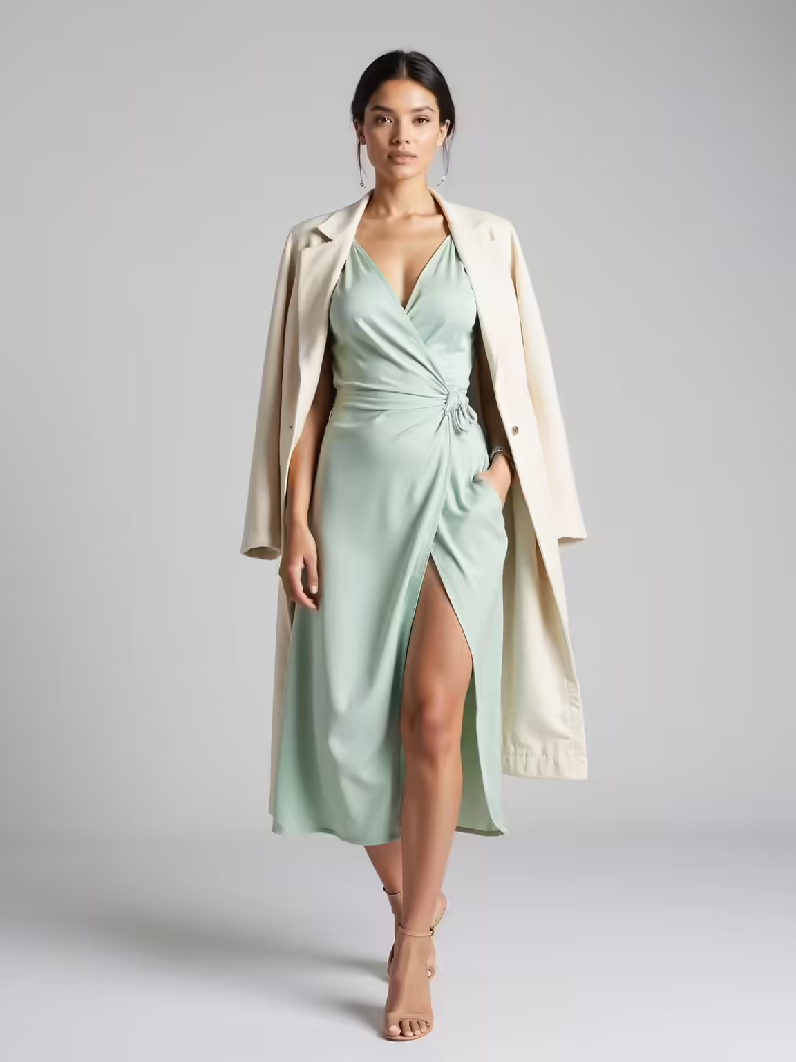
Timeless winter pieces like structured coats and neutral knits provide a chic cold-weather foundation that complements warm spring accents.
Warm Spring Quick Palette: Your Cheat-Sheet
I keep a tiny cheat-sheet of key Warm Spring hues—think golden daffodil, coral blush, and warm mint—that I pull out when I’m planning outfits.
I’ll show you how to mix neutrals like camel, warm ivory, and mocha so they lift those colors instead of washing them out.
Then I’ll give three quick outfit formulas you can repeat all season for an effortless, put-together look.
These pieces work especially well when you choose airy, breezy fabrics that maintain a light, elegant silhouette.
Key Warm Spring Hues
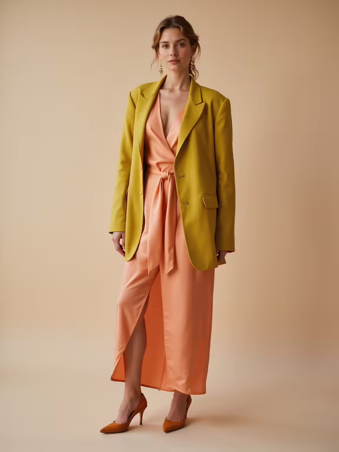
When I think of a Warm Spring palette, I picture sunlit apricot, golden marigold, and the soft green of new leaves—all hues that lift an outfit without shouting.
I favor coral, warm peach, honeyed yellow, and a gentle teal—each feels bright but grounded.
These colors flatter warm undertones, add effortless warmth, and pair playfully for daytime ease or quietly polished evenings.
Cute Spring Outfits for women bring these hues to life with fresh silhouettes and lively accessories.
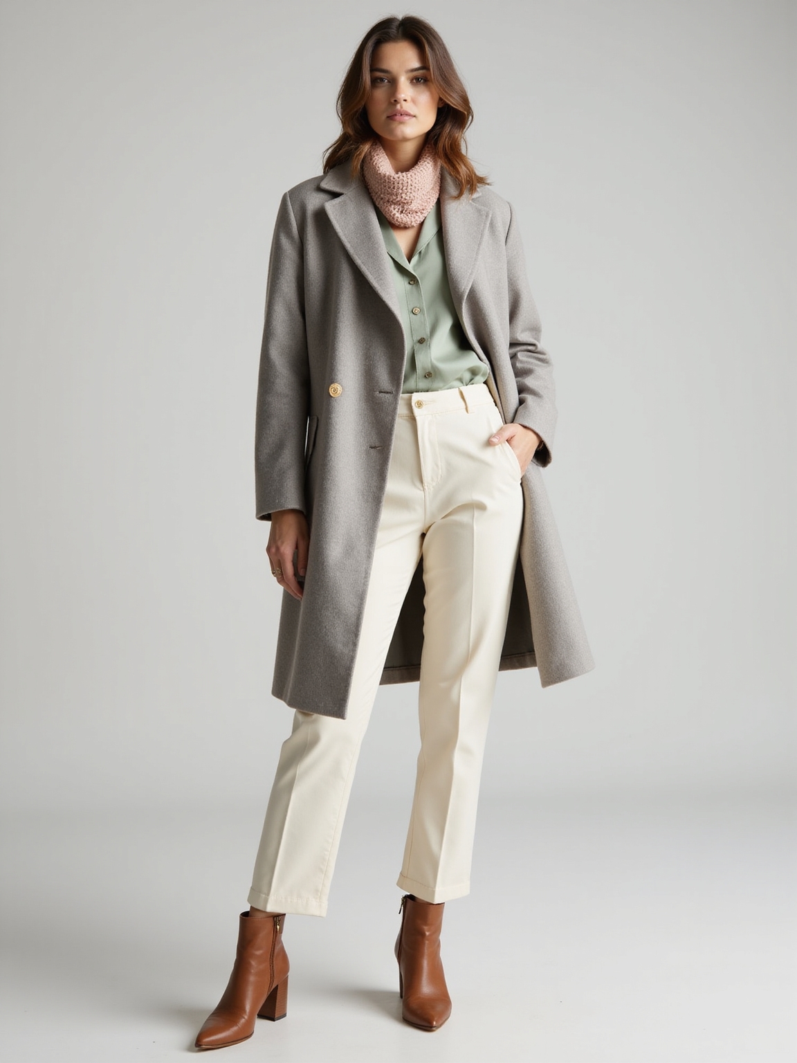
Mixing Neutrals Smartly
Because neutrals do the quiet work of a Warm Spring wardrobe, I treat them like supportive leads rather than background noise.
I layer warm beige, soft camel, and creamy ivory with one bright accent—peach or coral—so each neutral sings.
I mix textures—linen, suede, lightweight knit—to keep looks intentional, cozy, and effortless, ensuring my undertone stays luminous without overpowering subtle warmth.
This approach translates perfectly to fall office dressing when you embrace cozy and polished pieces for a professional yet seasonal look.
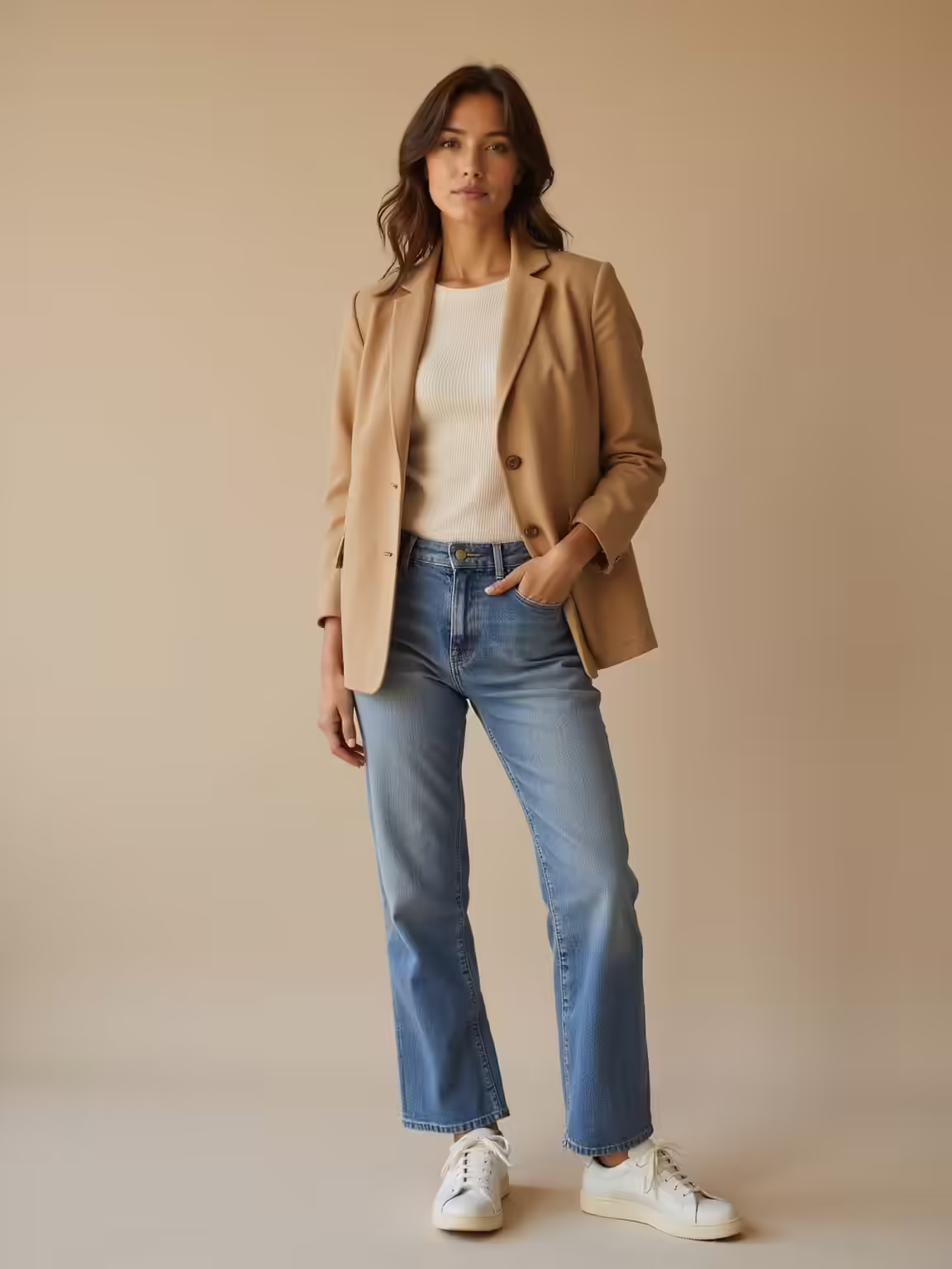
Quick Outfit Formulas
If you want foolproof outfits without overthinking, I’ve boiled my Warm Spring wardrobe down to a few easy formulas you can mix and match every week.
Start with a warm neutral base, add one bright accent (coral, goldenrod), and finish with a soft metallic or tan accessory.
Repeat with textured layers—linen jacket, silk scarf—and you’ll always feel polished, warm, and effortless.
Korean autumn styling often emphasizes layering lightweight textures for changing temperatures, which pairs well with Warm Spring palettes and textured layers.
Why Warm Spring Colors Flatter Your Undertone
I’ve noticed that warm spring hues seem to coax a natural glow from my skin, turning ordinary light into something a bit more flattering.
The soft, sunny tones create a gentle contrast that feels harmonious rather than harsh, so features look balanced and alive.
Warming colors also quietly amplify my undertone, so outfits feel like an effortless extension of who I am.
These palettes pair beautifully with a soft autumn capsule of muted, warm neutrals to create cohesive, wearable looks.
Warmth Enhances Skin Glow
When I want to look instantly rested and radiant, I reach for warm spring hues—peaches, golden corals, and soft amber—that wake up my complexion without heavy makeup.
Those tones reflect light subtly, smoothing shadows and bringing a healthy, lit-from-within look. I layer them in scarves or blushes, choosing pieces that feel effortless yet refined, so my skin reads naturally luminous all day.
I also rely on timeless wardrobe staples like classic pieces to keep the look polished and versatile.
Harmonious Color Contrast
Because my skin carries warm undertones, I choose spring hues that create a quiet contrast—soft peaches next to golden corals, warm ivories against honeyed amber—to make my complexion read brighter without shouting.
I layer muted citrus with gentle terracotta, pairing whispery mint accents to balance warmth.
The result feels effortless: refined, approachable, and subtly luminous, like sunlight filtered through linen.
Old money winter staples inform how I adapt these choices for cooler weather, keeping proportions timeless and fabrics luxe while maintaining a warm spring palette with classic layering to preserve both warmth and elegance.
Natural Undertone Amplification
If you lean warm like I do, wearing spring’s sunlit shades doesn’t just match your skin—it amplifies it, so your natural glow reads clearer and more alive.
I notice subtle shifts when I choose colors that echo my undertone: warmth deepens, eyes enliven, and everything feels effortless.
- Golden neutrals brighten my complexion
- Peach tones soften shadows
- Apricot lifts tiredness
- Warm ivory refines features
Signature Warm Spring Shades Every Wardrobe Needs
I lean into warm spring shades the way I reach for a favorite sweater—naturally and with purpose—because they do more than brighten a closet: they define a mood.
My essentials: golden marigold, buttery daffodil, soft tangerine, warm peach, avocado green, and honey beige.
Each piece layers effortlessly, lifts my complexion, and creates a quietly confident, sunlit wardrobe that feels distinctly mine.
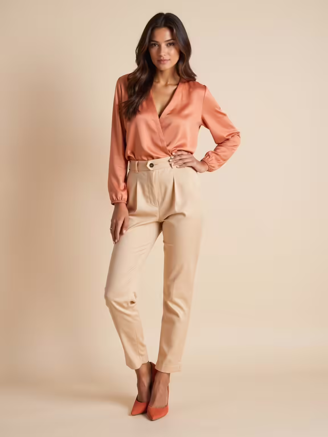
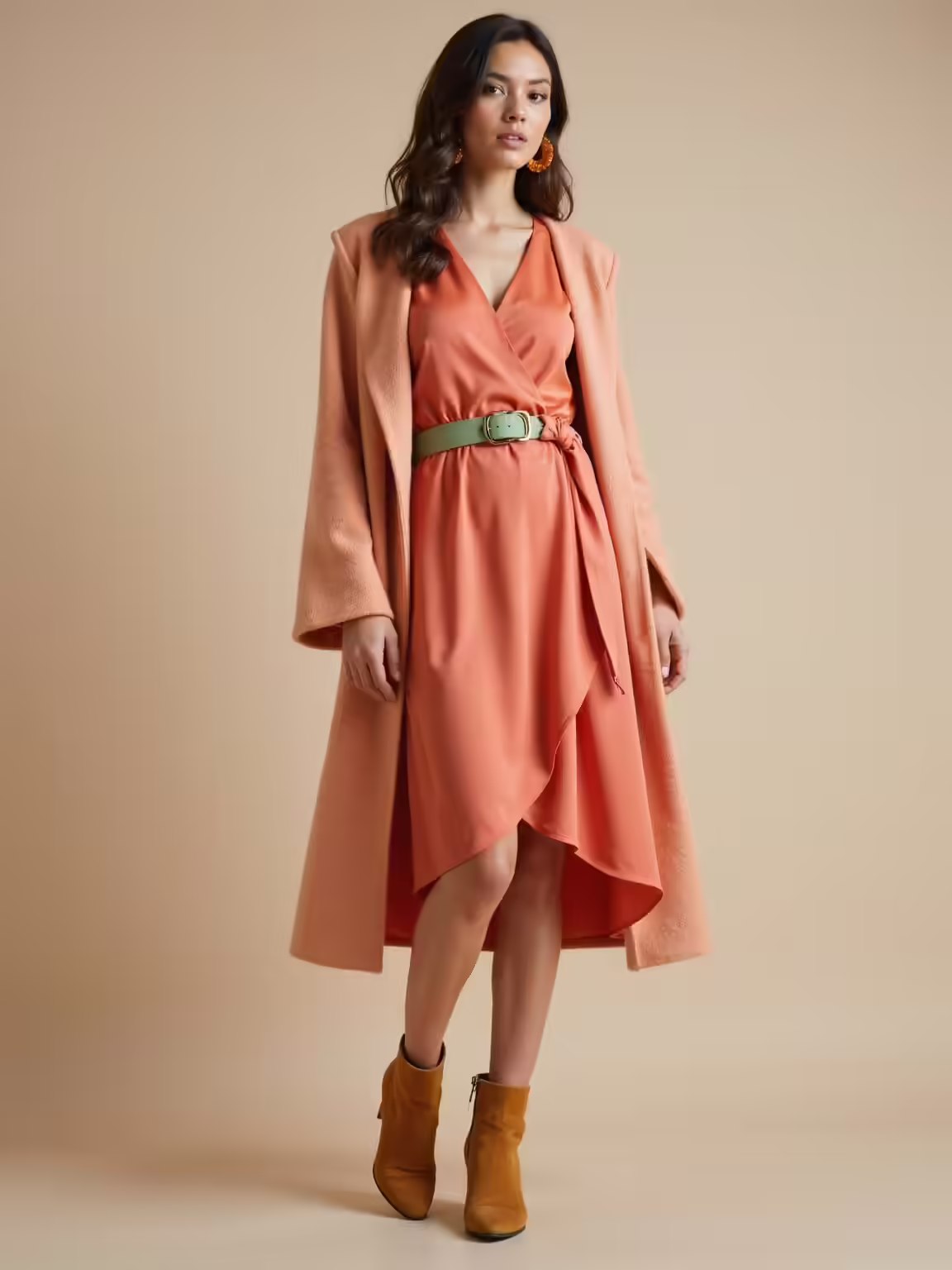
Best Warm Corals for Warm Spring Complexions
When coral walks into my wardrobe, it feels like sunshine with a wink—warm, lively, and unexpectedly flattering.
I reach for shades that hug my warm spring skin, balancing brightness with a soft glow.
- Peachy coral for daily warmth
- Tangerine coral to enliven evenings
- Salmon coral for subtle romance
- Coral-rose for polished meetings
Each choice lifts my complexion effortlessly.
Golden Yellows and Creams That Warm Your Face
I’ve been reaching for golden yellows and soft creams lately because they bring an immediate warmth to my complexion without overpowering the rest of my outfit.
I’ll show how those warmth-enhancing neutrals lift the face and how to pair them with cooler blues or mint accents so the look feels balanced, not muddy.
Stick with small cool-tone touches—like a scarf or accessory—and you’ll see how the contrast keeps the ensemble fresh and sophisticated.
Warmth-Enhancing Neutrals
Because my favorite spring trick is swapping cool basics for something with a golden glow, I reach for creams and soft yellows that instantly warm my face and lift an outfit.
- Lightweight cream cardigan for polished warmth
- Soft butter blouse to brighten complexion
- Warm beige trousers for understated glow
- Pale golden scarf to frame the face
They feel effortless, cozy, and quietly radiant.
Pairing With Cool Tones
Though cool blues and soft lavenders can be beautiful, I like to offset them with golden yellows and creams that warm my face and keep the palette feeling intimate; slipping a butter blouse under a slate blazer or tucking a pale-gold scarf into a chambray shirt instantly softens the coolness and makes the whole look glow.
I choose subtle gold jewelry and cream shoes to echo that warmth.
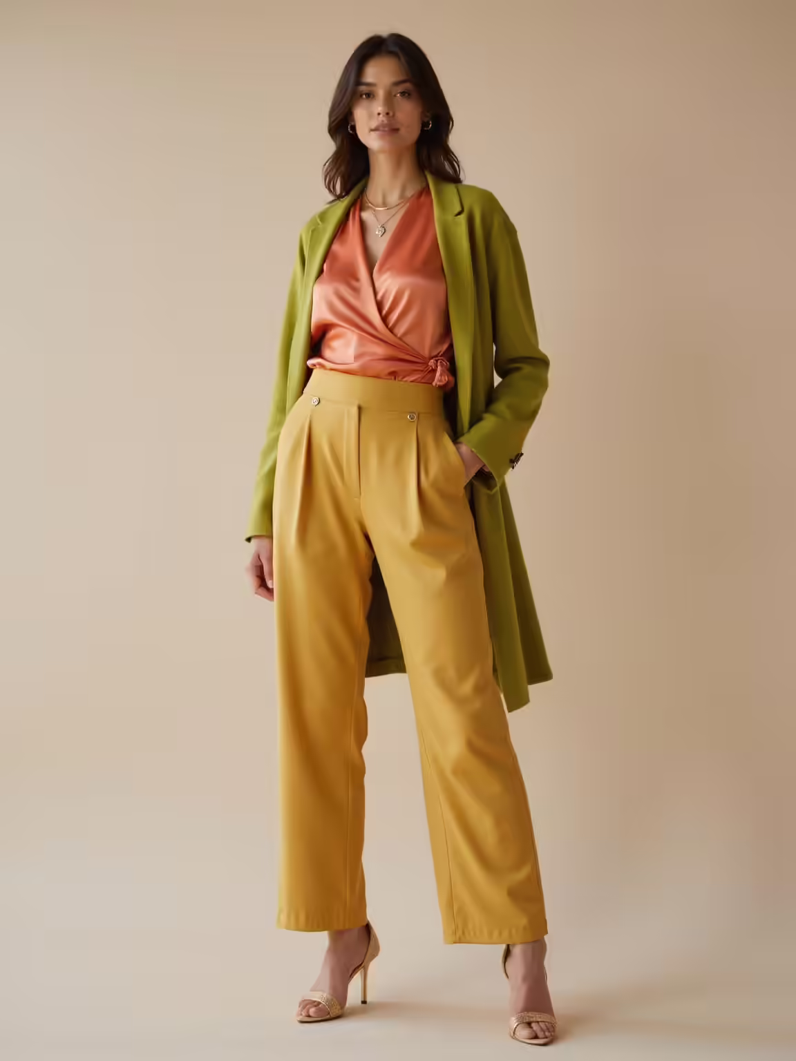
Clear Teals and Aquas for Fresh Contrast
I reach for clear teals and aquas when I want a fresh, modern contrast that still feels soft and wearable. They brighten warm skin without overpowering it; I layer them like a whisper of sea air. I pair textures and simple shapes, favoring effortless polish.
- Silk blouse for soft sheen
- Linen blazer for structure
- Skinny scarf for accent
- Neutral sandals for balance
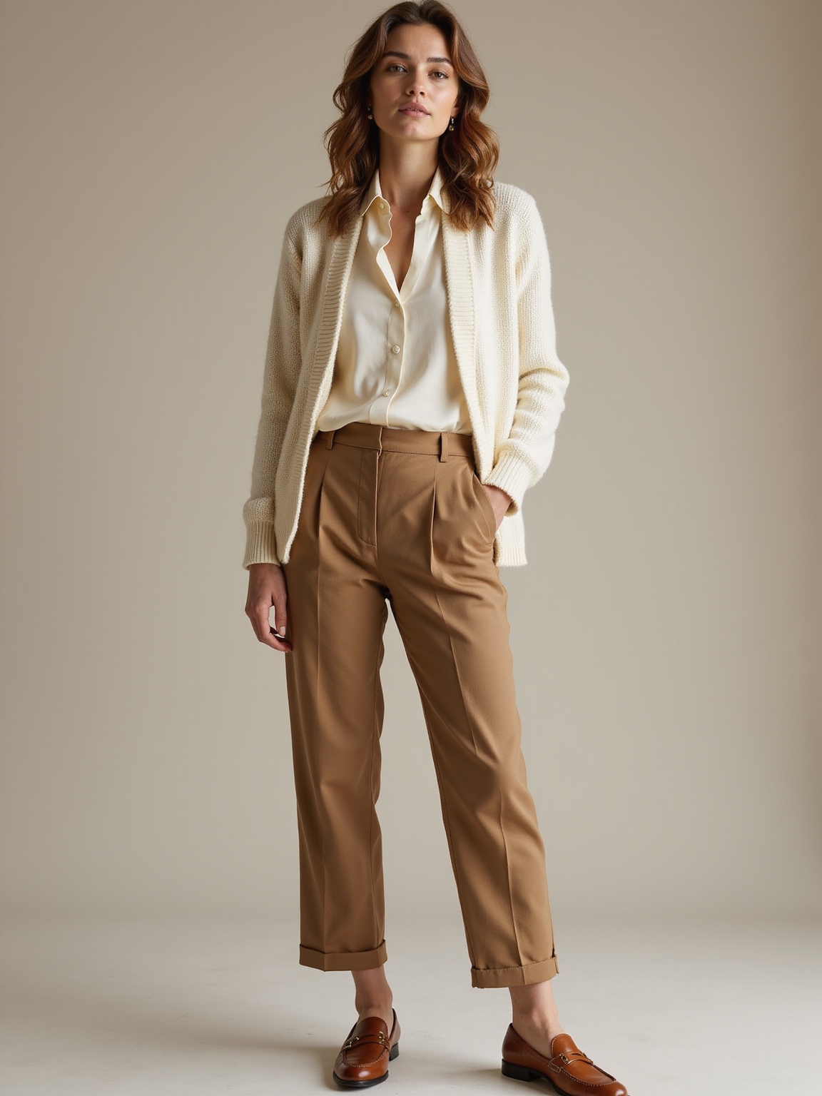
Soft Warm Neutrals to Build a Versatile Base
When I’m building a wardrobe that feels as calm as a sunlit room, I start with soft warm neutrals as the foundation; they anchor every outfit without stealing the show.
I layer creams, biscuit tans, and muted camel pieces—cashmere sweaters, linen shirts, tailored trousers—that mingle effortlessly with brighter accents. These tones keep looks refined, cozy, and endlessly mixable for any spring moment.
How to Mix Warm Spring Colors Without Clashing
If you want your warm spring colors to sing together, start by thinking of them as ingredients in a simple recipe: pick one dominant shade, one supporting tone, and a small accent to lift the whole look.
I’ll show you how I mix hues with confidence:
- Start bold, keep rest muted
- Use one warm neutral base
- Repeat the accent twice
- Balance textures for harmony
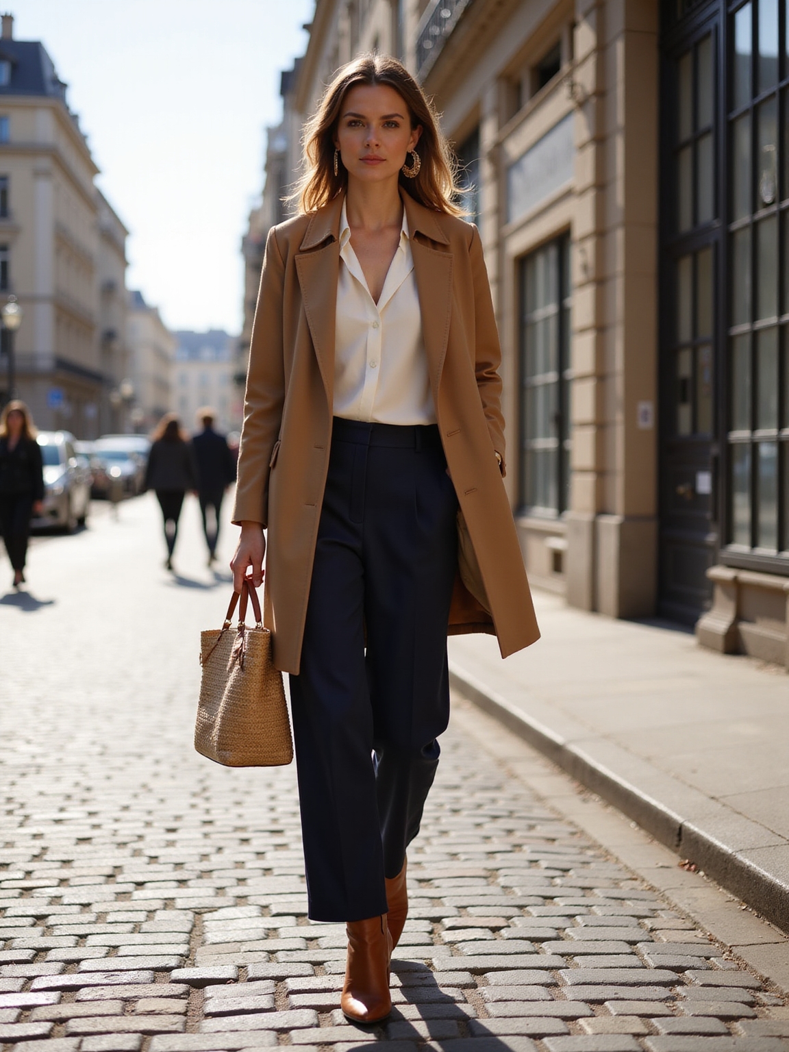
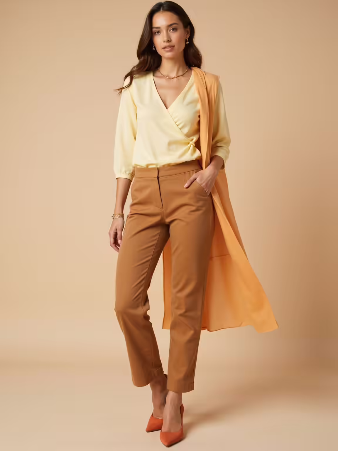
Work Outfit Formulas That Look Polished and Warm
Because a polished work wardrobe should feel as intentional as a well-brewed cup of tea, I build formulas that mix warm spring hues with classic shapes so I always look put-together without fuss.
I pair a camel blazer, soft coral blouse, and tailored cream trousers, adding gold accessories and a muted green scarf for dimension.
Each combo feels professional, cozy, and endlessly wearable.
Weekend Looks That Read Sunny and Effortless
When I plan a sunny, effortless weekend look I start with breezy pastel layers—think a lightweight mint cardigan over a lemon tee.
I anchor the outfit with warm-neutral basics like soft beige chinos and a tan leather slide for an easy, polished feel.
Then I add one playful accessory pop—a coral scarf or turquoise bag—to keep the mood cheerful without trying too hard.
Breezy Pastel Layering
I love pulling together breezy pastel layers for weekend plans—there’s something about a soft mint shirt over a lemon tee or a lavender cardigan tossed on a white sundress that instantly reads sunny and effortless.
I mix textures and light accessories to keep it relaxed yet refined:
- Linen shirt tied at the waist
- Lightweight tee in a warm spring shade
- Delicate gold hoops
- Espadrilles or woven flats
Warm-Neutral Basics
Start with sun-warmed neutrals and let the outfit do the smiling for you: I lean into soft camel tees, creamy linen trousers, and a slouchy sand-hued cardigan for weekends that feel effortless but put-together.
I finish with tan espadrilles and a structured tote, savoring how muted warmth reads sunny without shouting, keeping silhouettes relaxed, textures layered, and comfort elegantly intentional.
Playful Accessory Pops
I like to liven up a sun-soft neutral base with one or two playful accessory pops that feel effortless, not contrived.
I reach for small touches that tell a weekend story: color, texture, and a wink of pattern.
- A lemon silk scarf knotted at the neck
- Woven raffia belt over linen
- Tangerine enamel hoop earrings
- Polished tan loafers with a bright stitch
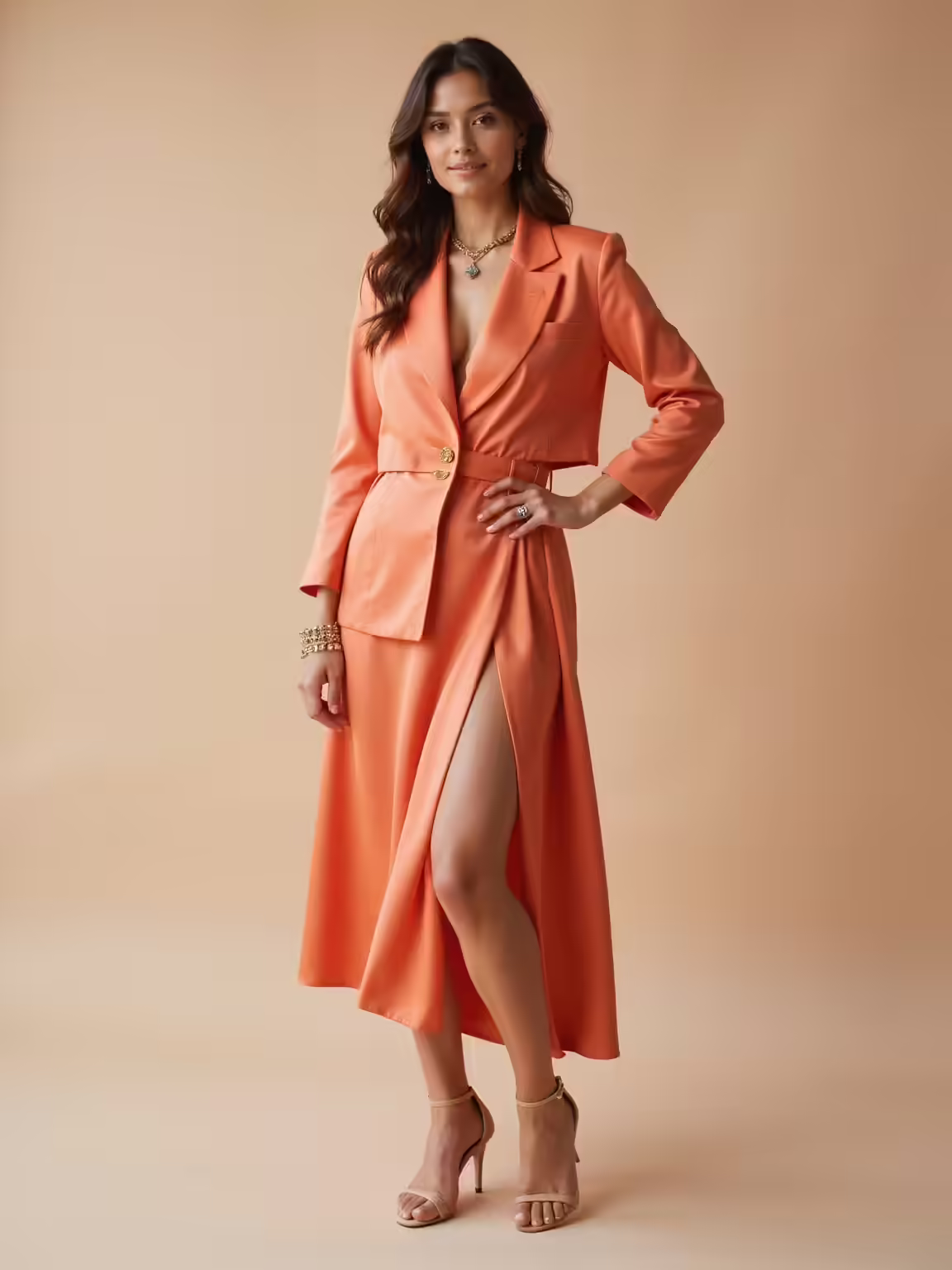
Warm Spring Evening Combos That Glow on Camera
When the sun softens into evening, I lean into warm spring shades that catch camera light and make skin glow; they’re my go-to for nights when I want to look effortless but intentionally put together.
I pick buttery apricot or soft gold silk, add a coral lip, and choose warm metallic accessories. Close-up shots love that subtle warmth and textured fabrics that read rich on film.
Prints and Patterns That Flatter Warm Spring Skin
Warm evening hues taught me that glow comes from more than color alone — pattern and print play a big role in how those tones read on skin and camera.
I lean into prints that warm without overwhelming:
- Soft florals in apricot and sage
- Lightweight ikat with golden threads
- Subtle gingham in warm ivory and honey
- Streamlined paisley with muted coral highlights
Accessories, Makeup, and Swatching Tips for Warm Spring
Because accessories and makeup finish a look the way a light breeze finishes a spring afternoon, I focus on pieces that enhance my skin’s golden undertone without stealing the show. I pick warm gold jewelry, coral blush, peachy lip tints, and soft bronze eyeshadow.
When swatching, test in natural light on jawline skin — not the wrist — to confirm harmony and glow.
6 Common Warm Spring Color Mistakes (and Fixes)
I love finishing an outfit with the right gold necklace or coral lip, but even small mistakes in color choice can flatten that sparkle. I’ve learned quick fixes that keep warmth alive:
- Avoid muddy browns; choose warm camel instead.
- Don’t pair cool pastels; pick butter yellow or peach.
- Skip gray black; try soft olive.
- Tone down neon; opt for muted coral.
I’ve loved guiding you through the Warm Spring palette—simple checks, go-to shades, and real-life fixes so your closet feels like sunshine.
Remember Sara, who swapped her ash-gray blazer for a coral-gold one and suddenly her whole face lit up at family photos—that’s the power of the right tone.
Try one small swap, notice the lift, and let warm corals and golden greens become your quiet signature for every season.